Fresh Paint Palettes for Fall 2017

2017 has been a year for the fan decks! From Spring’s blush and bold blues to Pantone’s playful color of the year, the future has been looking bright. Now with Fall right around the corner, we intend to keep the good times [and paint] rolling. With a wide selection of deep, romantic hues, you can easily bring Autumn vibes to your interior spaces. And although it makes sense to go with a timeless white or gray for your walls on most occasions, there is something so fun about adding a seasonal touch to your painted surfaces. Here are two considerations to help you start visualizing the pumpkin-spiced possibilities.
1. Be unexpected.
Try to think of creative and unexpected ways to use these trendy hues. What if you freshened up the interior lining of a bookcase? Or gave an outdated side table a pop of Fall flavor? Maybe your photo frames could use new life. There is no limit to the applications, when you use a little creativity.
2. Don’t fear the dark side.
Selecting a dark tone might seem risky. But these intense shades also create some of the most intimate and sophisticated rooms. I am constantly advocating for the blacks and deep colors, especially in open concepts that can have a tendency to feel cavernous. Maybe a navy tone or rich burgundy is the coat your walls are craving.
I had so much fun searching down the most gorgeous Fall paint colors for these palettes. Popular paint experts, Sherwin Williams and Benjamin Moore are always upping the pigment game with every new trend. So whether you are searching for the perfect neutral or an exciting option for your accent wall, there’s a little something for every space. Hope you are inspired to try them out and add a little spice to your surroundings this season.
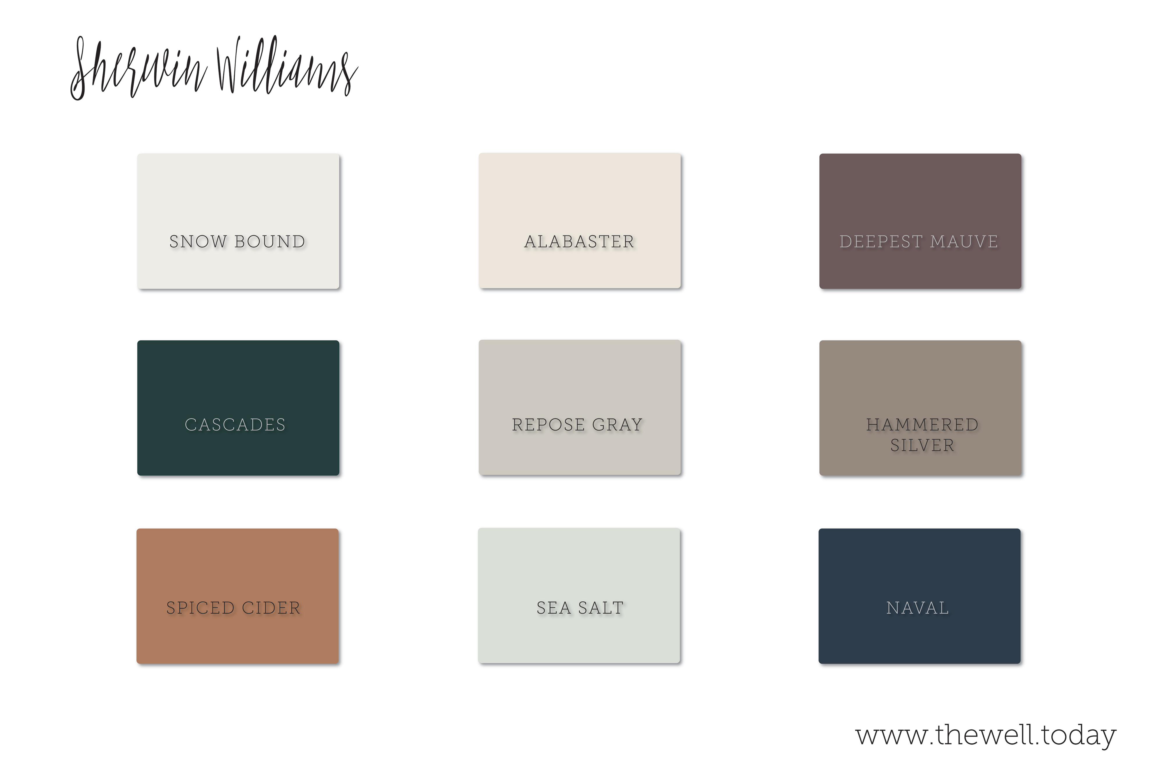
I am strongly considering considering Sea Salt as a new color for our front door and Cascades is the “color of the month.” What do you think?
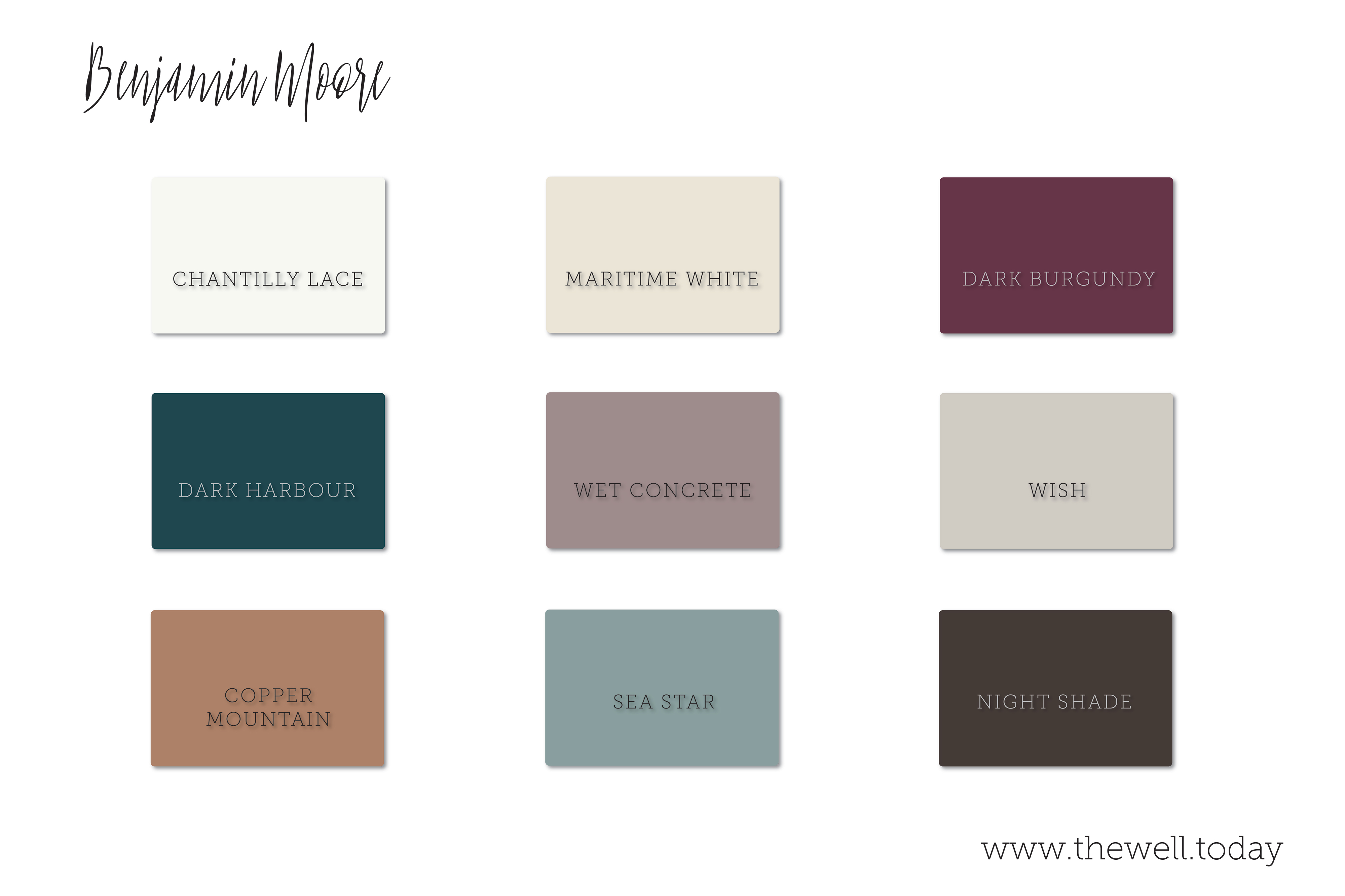
Chantilly Lace and Wish are the quintessential white and gray. Try pairing them with a bold accent of Copper Mountain or Dark Harbour for a stylish contrast.
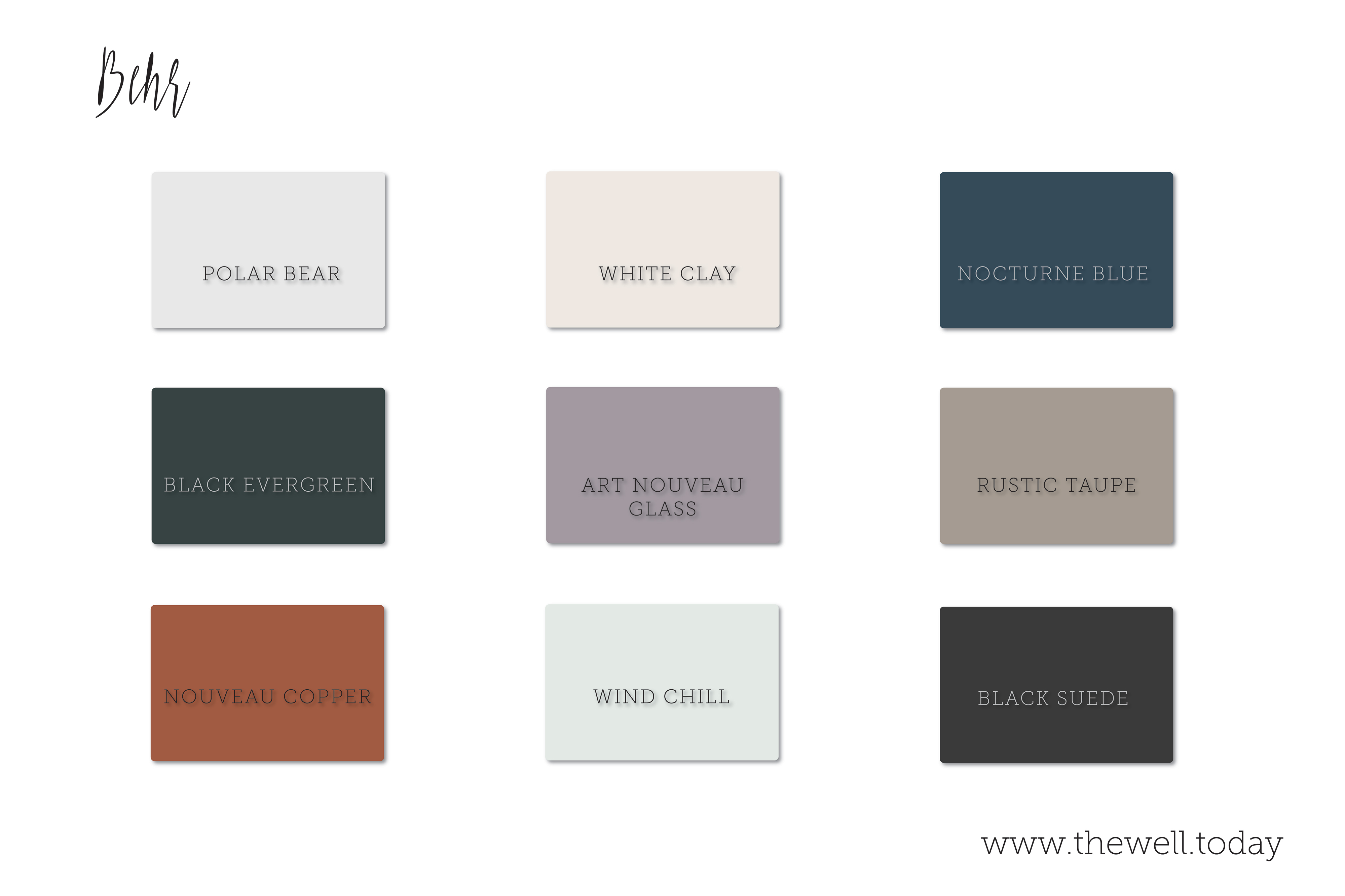
Of course when it comes to choosing paint for my own home, I prefer the cost effectiveness and convenience I can find at my nearby Home Depot. Behr’s collection of Marquee colors are typically EXACTLY what I’m looking for, and I have had nothing but good experiences with their premium paints.
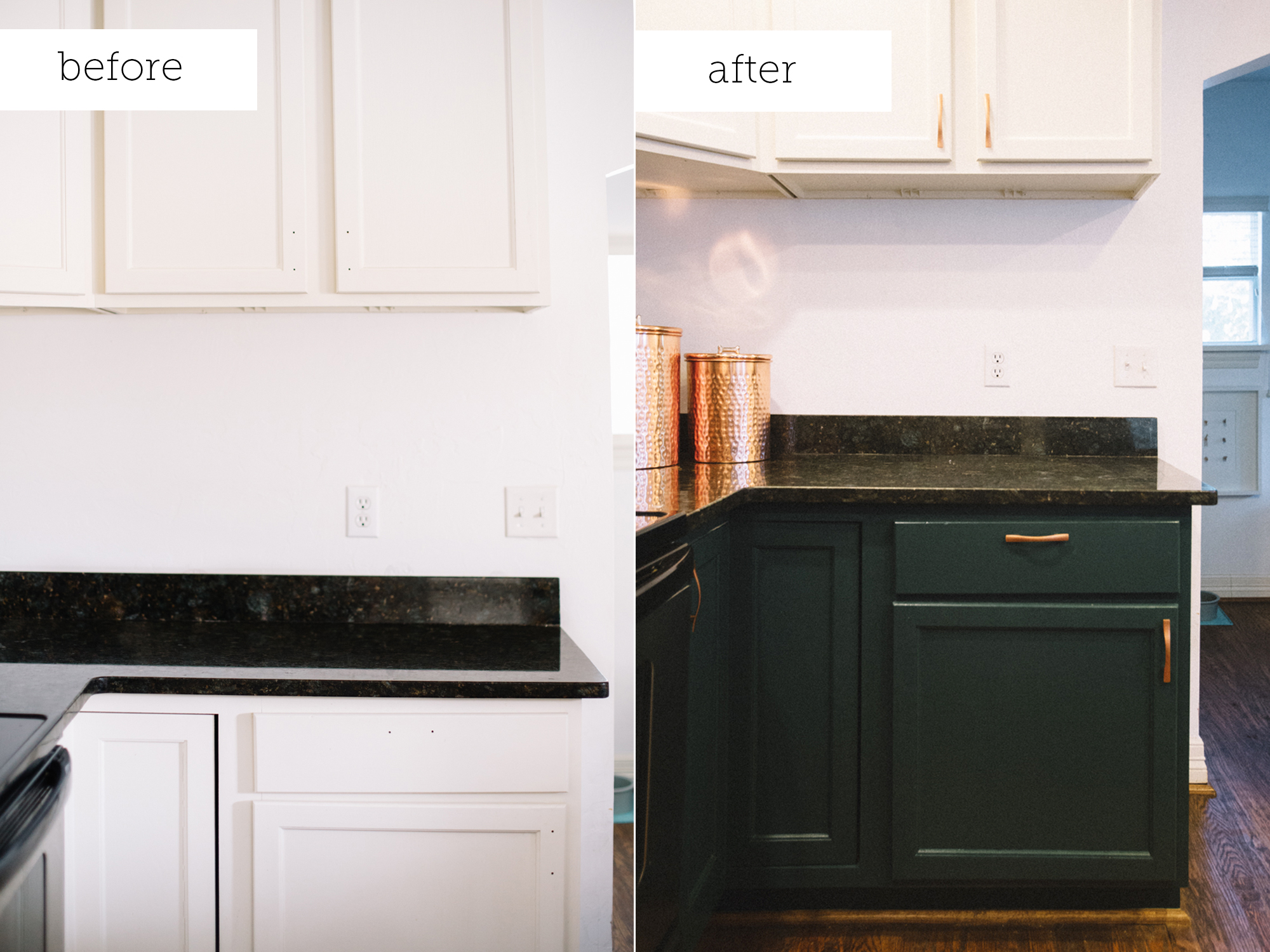
Most recently, I painted our lower cabinets in Black Evergreen. It turned out so chic and I am ecstatic with the result.
If you are in need of interior painting advice, check out my article for professional insider tips and tricks. Let me know what you think about these selections!